
AI and Home Design: Why Artificial Intelligence Falls Short in Paint Color Selection
Artificial intelligence has expanded our knowledge and experiences in many positive ways, including home design inspiration and decorating ideas. However, when it comes to paint color selection, AI often creates more confusion than clarity. While AI tools can be fun and visually inspiring, they are not reliable for choosing interior or exterior paint colors.
One of the biggest limitations of artificial intelligence in home decorating and color selection is its inability to accurately represent how paint colors look in real life. No matter how advanced the technology becomes, AI cannot fully account for how light and color are perceived by the human eye. Lighting conditions, both natural and artificial, dramatically affect how a paint color appears once it’s applied.
There are many factors that impact the final result of interior and exterior paint colors, including sunlight exposure, room orientation, surrounding materials, paint sheen, and existing architectural features. Artificial intelligence cannot accurately predict how these variables interact in a real-world environment.
As a professional paint consultant, I encourage homeowners to enjoy using AI for design inspiration, but not to rely on it for final color decisions. Understanding how light, materials, finishes, and space work together requires trained expertise and hands-on evaluation. AI can be a helpful starting point, but when it comes to choosing paint colors with confidence, seeking professional guidance ensures a result you’ll love long term.
A New Year, A New Hue
As we welcome in the new year, we often hear the phrase:“A new year, a new you.”
This year, consider welcoming a new hue into your home instead.
Color is trending strong in 2026. As I mentioned in my previous blog, color drenching is making a big statement. We’re seeing painted trim, doors, and mouldings — not just walls.
But let’s pause for a moment.
Trends come and go. In interior design, most trend cycles last about ten years or less. When the trend passes, how much time, labor, and expense will it take to repaint all of those doors, trims, and mouldings?
I love trends — especially when they’re blended with timeless design.
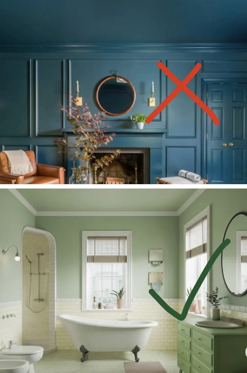
A great way to incorporate color drenching is to paint the walls and ceiling of a smaller room the same color, or a slightly deeper or lighter hue. Bathrooms, powder rooms, and small nooks are wonderful places to experiment.
I strongly recommend seeking professional color advice to be sure your selections harmonize with existing fixed elements such as countertops, tile, cabinetry, and flooring.
Color drenching is a beautiful, fresh look — and it works best when used thoughtfully and in the right spaces.
It’s not so black-and-white
It’s Not So Black-and-White
As someone currently in the market to buy a home, I can’t tell you how many properties I’ve toured featuring black-and-white kitchens, gray floors, and some variation of greige on the walls. We’ve endured nearly two decades of these safe but uninspired choices. Quite frankly, I think we’re all ready to move on.
So the question becomes: What’s next? As it turns out, several exciting trends are beginning to emerge.
The Return of Warm Neutrals
Warm, inviting neutrals are making a strong comeback, replacing cool grays and stark whites with softer, more livable tones.
Benjamin Moore – Silent Breath (OC-7)
A warm, barely-there off-white with subtle beige undertones
Benjamin Moore – Alexandria Beige (HC-77)
A warm, classic beige that feels modern again
Popular in both transitional and traditional interiors
Sherwin-Williams – Natural Linen (SW 9109)
A warm beige with subtle depth, ideal for whole-home palettes
The Rise of Color Drenching
Another growing trend is color drenching, which involves painting walls, trim, and ceilings in the same—or closely related—saturated hue. This technique creates immersive, cohesive spaces that feel intentional and dramatic, rather than fragmented.
Deep, Rich Hues Take Center Stage
Bold, moody colors are also stepping into the spotlight, offering depth, character, and sophistication.
Benjamin Moore – Cinnamon Slate (2113-40)
Benjamin Moore Color of the Year
A balanced blend of plum, brown, and soft gray
Benjamin Moore – Ashwood Moss (1484)
A deep olive green with warm brown undertones
Sherwin-Williams – Urbane Bronze (SW 7048)
A deep brown-gray with warm undertones
Popular for accent walls, doors, cabinetry, and trim
Sherwin-Williams – Carnelian (SW 7580)
A rich, earthy red with brown undertones
Reflects the rise of heritage-inspired and clay-based colors
Before You Jump In…
If you think you’re ready to fully embrace these trends, I would encourage you to pause and think again. While these colors and techniques are undeniably beautiful, it’s important to avoid falling into another trend cycle too quickly. Many of these looks come with challenges that aren’t always obvious at first glance.
What’s Next?
Stay tuned to my blog, where I’ll dive deeper into the potential problems and practical considerations of working with warm neutrals, color drenching, and bold hues — so you can make informed, lasting design decisions.